Genetics Workshop
VitisGen3 Postdoctoral Research Associate
Cornell Institute of Biotechnology
Introduction
This hands-on exercise is the second of three as part of the 2024 VitisGen3 Genetics Workshop. This goal of this workshop is to help VitisGen3 participating breeding programs and researchers learn how to work with their own rhAmpSeq data from acquisition to QTL. However, some of these tools and methods can also be transferable to other sequence types. Throughout all the hands-on exercises, we will be working with the sequence and phenotype data of the Vitis x doaniana 'PI 588149' x 'Chardonnay' F~1~ family from Zou et al., 2023 that was used to map a novel grapevine downy mildew resistance locus, Rpv33.
In this hands-on, we will focus first on working with phenotype data in RStudio, from basic quality checks to transformation and prepping it for trait mapping. Then, we will use those phenotypes in Tassel to perform a GWAS after filtering our sequence data and generating an MDS plot to check for contaminant samples. By the end of this hands-on you should have a functional understanding of performing a GWAS in Tassel that you can apply to your own data in the future.
Required Programs
RStudio
Access through the BioHPC server (recommended to follow along with the hands-on)
Users outside Cornell need to follow the instructions (section 3.4.1) at https://biohpc.cornell.edu/doc/vitisgen3_ws/vitisgen3ws_prep.html
All users will need to login to Linux command line of cbsuvitisgen2.biohpc.cornell.edu, run this command. This is to setup up rstudio cache directory. You just need to do it once.
x
/programs/rstudio_server/mv_dirThen copy/paste this link (http://cbsuvitisgen2.biohpc.cornell.edu:8016) into your browser and log in with your BioHPC credentials.
You can also install R and RStudio on your local machine
Download at https://posit.co/download/rstudio-desktop/ and follow the instructions
Tassel 5.0
Install on your local machine
Download at https://www.maizegenetics.net/tassel and follow the instructions
Citation: Bradbury et al., 2007
Working with Phenotype Data
In this section, we will cover how to load data into the R environment, see if there are any outliers, check the phenotype distribution, and finish off with performing Box-Cox transformations. We will be working with two of the columns of phenotype data that were used in Zou et al., 2023 to map Rpv33.
Getting Started with RStudio
At the beginning of every R session, we need to set our working directory and load the files we want to work with into the R environment. In the first hands-on, you should have created a working directory for yourself on the cbsuvitisgen2 machine and we will work within the same one for this hands-on. The raw phenotypes we need should be in the "/workdir/VG3Workshop_23" folder. Let's set our working directory and load that file.
xsetwd("/workdir/[your BioHPC username]") # without the brackets
pheno <- read.delim("/workdir/VG3Workshop_23/VG3WorkshopPhenotypes.txt", header = T)
Plotting the Data
Now that our data is in R, we can get a sense of what we have. We will start by taking a quick look at the data itself. Next, we will plot histograms and QQ-plots to look at the distribution of each phenotype and see if they have any outliers that we need to remove.
xxxxxxxxxx### Quick look at the data
# prints the first 5 rows of phenotype datahead(pheno, 5)## Console Output ## # TaxaID Incid_2019 Sev_2021# 1 Oblock13-1__vDNAcad437D01_A01 20 38.75# 2 Oblock13-10__vDNAcad437D01_B02 30 67.50# 3 Oblock13-11__vDNAcad437D01_C02 0 30.00# 4 Oblock13-12__vDNAcad437D01_D02 5 75.00# 5 Oblock13-13__vDNAcad437D01_E02 5 67.50
# summary stats about each columnsummary(pheno) ## Console Output ### TaxaID Incid_2019 Sev_2021 # Length:220 Min. : 0.00 Min. : 7.50 # Class :character 1st Qu.: 0.00 1st Qu.:51.88 # Mode :character Median : 10.00 Median :65.00 # Mean : 20.16 Mean :62.95 # 3rd Qu.: 40.00 3rd Qu.:77.50 # Max. :100.00 Max. :93.75 # NA's :5 NA's :33
### Histograms and QQ-Plots
# tells R that we want four plots in the plot windowpar(mfcol = c(2, 2))
# plots the histogramhist(pheno$Incid_2019, main = "Histogram of Incid_2019")# plots the qqplotqqnorm(pheno$Incid_2019, main = "QQ-Plot of Incid_2019")# adds the line to the qqplotqqline(pheno$Incid_2019)
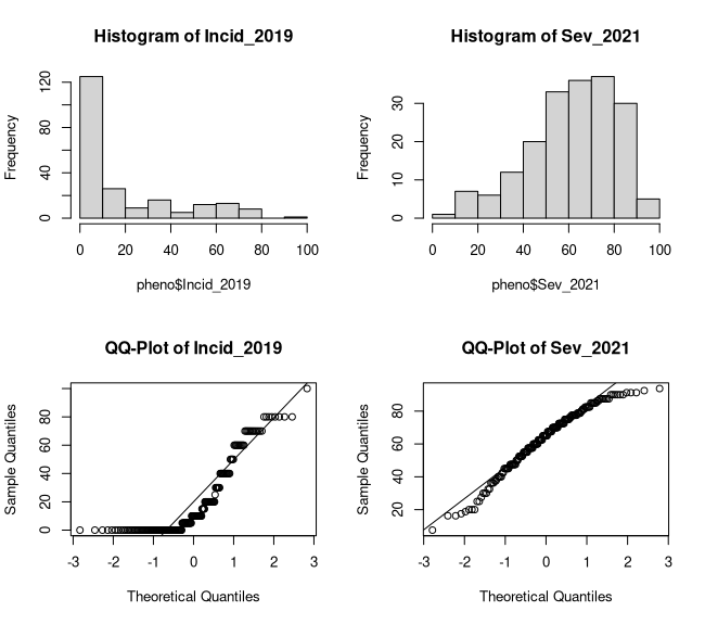
# repeats plots for severityhist(pheno$Sev_2021, main = "Histogram of Sev_2021")qqnorm(pheno$Sev_2021, main = "QQ-Plot of Sev_2021")qqline(pheno$Sev_2021)The summary statistics tell us that we have three columns in our phenotype file with 220 taxa. Specifically, these phenotypes are grapevine downy mildew ratings, incidence from 2019 and severity from 2021. Both were rated on a percentage scale from 0-100% in a single environment without replications. Lastly, we can also see 5 and 33 missing values (NA's) for incidence and severity, respectively. As for the plots (Figure 1), there are no obvious outliers but both traits have skewed distributions although the incidence ratings are more heavily skewed.
Figure 1: Phenotype Distributions
Missing Data and Box-Cox Transformation
Now that we know what we are dealing with, we have a few things to do to get this data ready for mapping. If had been outliers, we would likely replace those data points with NAs since we don't have replications to do a mean replacement. For the missing data, there will likely be taxa (genotypes/vines) that are missing for both phenotypes and will just be tagging along for the ride and not adding anything to our analysis. Let's check to see if there are any and remove them before continuing on to phenotype transformation.
xxxxxxxxxx### Identifying and Removing Taxa with Missing Data
# outputs the number of taxa that are missing for both traitssum((is.na(pheno$Incid_2019) & is.na(pheno$Sev_2021)))## Console Output ## # [1] 5
# gets the names of the 5 we need to droptodrop <- pheno$TaxaID[which(is.na(pheno$Incid_2019) & is.na(pheno$Sev_2021))]
# prints the TaxaIDs to drop todrop ## Console Output ### [1] "Oblock13-80__vDNAcad437D01_E10" "Oblock14-31__vDNAcad438D02_G10"# [3] "Oblock15-27__vDNAcad439D03_C06" "Oblock15-29__vDNAcad439D03_E06"# [5] "Oblock15-42__vDNAcad439D03_B08"
# drops the taxa from phenopheno <- droplevels(pheno[which(!(pheno$TaxaID %in% todrop)), ])
# checking our work sum((is.na(pheno$Incid_2019) & is.na(pheno$Sev_2021)))## Console Output ## # [1] 0
In the attempt to normalize our traits, we will perform a Box-Cox transformation to see if their distributions improve using functions from the "MASS" package. Briefly, we first need to determine the lambda value most likely normalize our phenotype which is then plugged into a formula for the actual transformation. If you want to know more about the Box-Cox transformation, you can start here: https://www.statisticshowto.com/probability-and-statistics/normal-distributions/box-cox-transformation/.
xxxxxxxxxx### Box-Cox Transformation
# installs the R package install.packages('MASS')
# loads the package into your R environment library(MASS)
# finding the lambda value visually by identifying the peak (Figure 2)par(mfrow = c(1, 2), mar = c(4.1, 4.1, 1, 1))boxcox(Incid_2019 + 1 ~ 1, lambda = seq(-5, 5, 1/10), data = pheno, xlab = "Incid_2019: Lambda")boxcox(Sev_2021 + 1 ~ 1, lambda = seq(-5, 5, 1/10), data = pheno, xlab = "Sev_2021: Lambda")
# we can also coerce the figures to data frames...incid_lambda <- as.data.frame(boxcox(Incid_2019+ 1 ~ 1, lambda = seq(-5, 5, 1/10), data = pheno, plotit = F))sev_lambda <- as.data.frame(boxcox(Sev_2021 + 1 ~ 1, lambda = seq(-5, 5, 1/10), data = pheno, plotit = F))
# ...and extract the lambdas we need find finding the maximum log-likelihoodincid_lambda <- incid_lambda$x[which.max(incid_lambda$y)]incid_lambda## Console Output ### [1] 0
sev_lambda <- sev_lambda$x[which.max(sev_lambda$y)]sev_lambda## Console Output ## # [1] 1.6
### Doing the Transformation
# a Box-Cox lambda value of 0 means a log2 transformationpheno$BCT_Incid_2019 <- log2(pheno$Incid_2019 + 1)
# Severity requires the formula pheno$BCT_Sev_2021 <- (((pheno$Sev_2021 + 1) ^ sev_lambda) - 1) / sev_lambda
# Checking the distributions (Figure 3)par(mfcol = c(2, 2), mar = c(4, 4, 4, 4))hist(pheno$BCT_Incid_2019, main = "Histogram of BCT_Incid_2019")qqnorm(pheno$BCT_Incid_2019, main = "QQ-Plot of BCT_Incid_2019")qqline(pheno$BCT_Incid_2019)hist(pheno$BCT_Sev_2021, main = "Histogram of BCT_Sev_2021")qqnorm(pheno$BCT_Sev_2021, main = "QQ-Plot of BCT_Sev_2021")qqline(pheno$BCT_Sev_2021)
Figure 2: Finding Our Box-Cox Lambdas
![]()
Figure 3: Box-Cox Transformed Distributions
![]()
Making Decisions and Saving Files
While we can say that both distributions somewhat improved, I would say only the severity ratings improved enough to be considered approximately normal (Figure 3). In reality, the appropriateness of using non-normal data for GWAS and QTL mapping varies by a number of factors. For the sake of this hands-on, we will continue with the untransformed incidence ratings and use non-parametric mapping methods when necessary. As a contrast, we will be using the transformed severity ratings and models that expect more normally distributed data. Let's make the required changes to our dataframe and save it to our working directory.
xxxxxxxxxx### Making Decisions ###
# removes the column from the dataframe pheno$BCT_Incid_2019 <- NULLpheno$Sev_2021 <- NULL
# saves the dataframe as a tab-delimited text file write.table(pheno, "Phenotypes4Mapping.txt", quote = F, row.names = F, sep = "\t")
GWAS in Tassel
This section goes through the steps to complete a GWAS in Tassel. After preparing the files we need, we will load them into Tassel, do some marker filtering, generate an MDS plot, and then finish up with the GWAS itself. If you're continuing on from the phenotype section, you will need to transfer the phenotype file from the BioHPC onto the local machine where you installed Tassel.
Preparing Files for Tassel
The two files we need include our phenotype file, reformatted for Tassel, and the .vcf file with the genotype calls for our mapping population, the 'PI 588149' x 'Chardonnay' F~1~ family, described in Zou et al., 2023. Let's start with reformatting the phenotype file in Excel. Since we saved the phenotypes as a tab-delimited .txt file, we need to go through Excel's Text Import Wizard in order to work with it.
Open Excel
Click "Open Other Workbooks"
Navigate to the directory where you saved your phenotype file
Click "All Excel Files" in the lower right corner and change it to "All Files (*.*)"
Your phenotype file should be visible now, double-click it
In the Text Import Wizard, choose "Delimited" and "My data has headers"
Click "Finish"
Add the top two rows of the following table to your file above the column names
<Phenotype> taxa data data TaxaID Incid_2019 BCT_Sev_2021 Save the file
Next, let's regenerate a .vcf file following similar steps to those in the first hands-on while connected remotely to the BioHPC. This .vcf file will include multiple runs of the parents along with only the phenotyped progeny. For ease, the family file needed for slicing the hap_genotype file is already prepared and can be found in the "/workdir/VG3Workshop_23" folder with the other provided data. Once it's generated, transfer that .vcf file to your local machine and you're ready for Tassel.
xxxxxxxxxx### Preparing our GWAS VCF ###
# calling our working directory on the BioHPCcd /workdir/$USER
# copy the hap_genotype and family files to your working directory cp /workdir/VG3Workshop_23/hap_genotype ./cp /workdir/VG3Workshop_23/phenotypedtaxa ./
# slices the hap_genotype based on the taxa in the phenotypedtaxa/workdir/amplicon/slice.py -i ./ -o hands-on2 -f phenotypedtaxa -a 0.001
# creates a haplotype vcf that we will use for GWAS it will also create# two other files but we won't worry about those for nowto_lep_map.pl -g hands-on2/hap_genotype -f 0.001 -n Hands-On2_Tassel# ps: if this prints a bunch of warnings into the console, that is normal and everything is fine.
Opening Files in Tassel
Let's get the genotype .vcf and phenotype table open in Tassel so we can get mapping!
Open Tassel on your local machine
Click "File" then "Open As..." in the top left corner
Leave "Format" as "Make Best Guess"
For the .vcf file
Select both "Sort Positions" and "Keep Depth" before clicking "Ok"
For the phenotype table
No selections before clicking "Ok"
Select the file you want to open then click "Open"
Filtering the Genotype Table
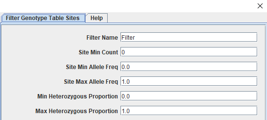
With our genotype table in Tassel, we can see more information about it on the left side of the Tassel window. The top panel on the left side shows the files you have loaded/generated within Tassel's file structure. The middle panel shows the total number of taxa and sites along with the breakdown of sites per chromosome. The table should have 219 taxa (our 215 phenotyped taxa with two sets of genotype calls for each parent) and 1991 sites. These sites have had minimal filtering as part of genotype calling and need to paired down to informative and high quality markers for trait mapping. We will start by filtering for call rate (missingness), followed by minor allele frequency, and then for polymorphic sites. The way filtering sites works in Tassel is through a specific window accessed by clicking "Filter" followed by "Filter Genotype Table Sites". The screenshot below (Figure 4) shows the top section of the window that should open. We can do our filters by only changing the values in these first six boxes.
Figure 4: Tassel's Filter Sites Window
The following table summarizes the steps we will use to filter the sites in our genotype table. For each filter, be sure to add a unique "Filter Name" to the top box as it will be appended to the name of the newly created genotype table within Tassel's file structure. This will help you keep tabs of the effect of each filter and backtrack as needed. I also recommend setting each value back to it's default as you move to the next filter.
| Filter Target | Tassel Parameter | Value | Sites Remaining |
|---|---|---|---|
| 80% Call Rate (219 taxa * .8 = 175.2) | Site Min Count | 176 | 1856 |
| Minor Allele Frequency > 0.05 | Site Min Allele Freq Site Max Allele Freq | 0.05 0.95 | 1776 |
| Polymorphic Sites | Min Heterozygous Proportion Max Heterozygous Proportion | 0.01 0.99 | 1294 |
Generating an MDS Plot
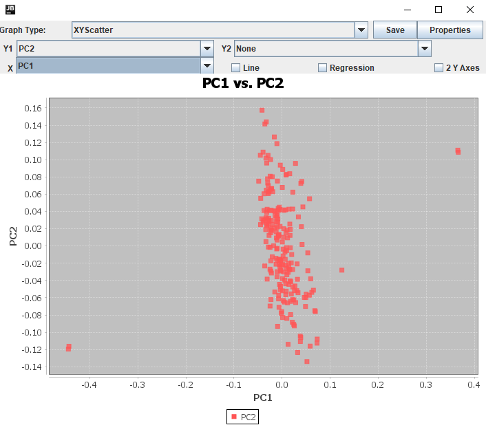
Now that the sites are filtered, we have one last thing to check before the GWAS. Plotting our genotype data as an MDS (Multi-Dimensional Scaling) plot allows us to tell a couple things about it. From a practical perspective, an MDS plot will let us check the purity of our samples and gives us a way to summarize the population structure as covariates for a GWAS. We will be looking for any progeny that are not grouping with their siblings, as either off on their own (contaminants) or grouping with the seed parent (selfs). The primary reason we recommended sequencing the parents alongside the progeny in mapping populations is for this step as it would be incredibly difficult to judge true progeny from contaminants and selfs without them. In Tassel, we can get our MDS by first calculating a distance matrix of our filtered genotype table then generating the principal components for the MDS plot.
Click "Analysis", "Relatedness", then "Distance Matrix"
Click "Analysis", "Relatedness", then "MDS"
Click "Ok"
Make sure you have the "Numerical" table starting with "MDS_PCs" selected
Click "Results" then "Chart"
Change "Graph Type:" to "XYScatter"
Change "Y1" to "PC2"
Change "X" to "PC1"
An MDS plot (similar if not the same as Figure 5) should appear, showing three main groupings and one dot a little on its own. With the "MDS_PCs" table still open, you can click on the column headers for each PC to sort the values and determine which points on the plot are which taxa. For the below plot, the two runs of the seed parent "PI 588149" are in the lower left while the two runs of the pollen parent "Chardonnay" are in the top right. I can also see that the lonely point just off the main cluster is "Oblock14-23". Unfortunately for it but luckily for us, that's the only F~1~ that needs to be dropped before we move on to GWAS.
Figure 5: MDS Plot
Filtering Taxa
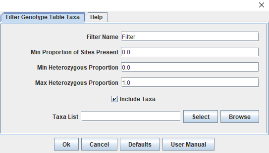
Functionally, filtering taxa is similar to filtering sites. By clicking "Filter" then "Filter Genotype Table Taxa", we can access the window we need (Figure 6). In other circumstances, this would be the window where you would also filter taxa with a high proportion of missing data, however this family has very little missing data and that step isn't necessary. We can also use this window to remove specific taxa through the "Taxa List" box. A new window will open after clicking "Select" that shows "Available" taxa on the left and "Selected" taxa on the right. Before running the GWAS we need to remove the four parental runs as we no longer need them and our contaminant individual from the MDS.
588149_vDNAcad437D01_G12
588149_vDNAcad437D01_H12
Chardonnay_vDNAcad439D03_C12
Chardonnay_vDNAcad439D03_D12
Oblock14-23_vDNAcad438D02_G09
Once these five individuals are in the selected column (highlight them in "Available" and click "Add ->"), click "Capture Unselected" and then "Ok". Our ready-for-GWAS genotype table now has 214 taxa and 1294 sites.
Figure 6: Tassel's Taxa Filtering Window
Running a GWAS
We are nearly ready to perform the GWAS on our two phenotype traits. We just need to make sure all the pieces are in order. The first thing to do is to generate new PCs for the genotype table we will be using for the GWAS (our first set of PCs included the parents and the contaminant, which are no longer included). Once we have that, we will first run a generalized linear model (GLM) then a mixed linear model (MLM).
Generalized Linear Model
Hold down the ctrl key and select:
GWAS-ready genotype table
That table's "MDS_PCs"
Phenotype Table
Click "Data" then "Intersect Join"
Click "Analysis", "Association", "GLM", then "Ok"
Mixed Linear Model
Generate a Kinship Matrix
Select GWAS-ready genotype table
Click "Analysis", "Relatedness", "Kinship", then "Ok"
Hold down the ctrl key and select:
Intersected table used for GLM
Kinship Matrix ("Centered_IBS")
Click "Analysis", "Association", "MLM", "Run", then "Ok"
We now have several tables under the Results -> Association folder within Tassel. The "GLM_Stats" and "MLM_statistics" table have the results of our analyses. Tassel has built in plots for us to quickly visualize our GWAS. Let's look at all the results to see how things went by looking at the Manhattan and QQ plots.
Manhattan Plot
Click "Results", "Manhattan Plot", Select Trait, then "Ok"
QQ-Plot
Click "Results", "QQ Plot", then "Okay"
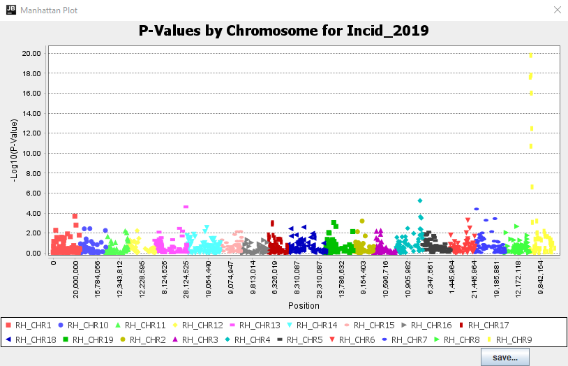
Thanks to these plots, we can see that both GLM and MLM produced supported peaks that are at high enough LODs to assume significant hits on Chromosome 9 for both phenotypes (Figure 7). In comparing the models, we can see that the GLM produced greater LOD scores than the MLM for both traits while the QQ plots don't suggest any issues.
Figure 7: Tassel Manhattan Plot
Saving Files Out of Tassel
Although the Tassel plots tell us we likely have QTL, we still need to determine the significance thresholds for our traits and produce some higher quality plots along the way. The first step is saving the necessary files out of Tassel. This can be done by clicking "File" then "Save As" while you have the tables you want to save highlighted.
Recommended Files to Save:
GWAS-Ready genotype table; Format "VCF"
"MDS_PCs" with parents; Format "Phenotype"
"GLM_Stats"; Format "Table"
"MLM_Stats"; Format "Table"
Once you have them all saved, transfer the GLM and MLM_stats tables to the BioHPC where we will work with them in RStudio and make some nicer figures.
Plotting Our Results in R
In this section, we will do our multiple test corrections by calculating both the Bonferroni significance threshold and the Benjamini-Hochberg cutoff in RStudio. As our last step, we will then visualize the create some nice Manhattan and QQ-plots to visualize our results.
Reading in Our Files
As before, we will start with setting our working directory and read in our files. For the hands-on, we will focus on the MLM results but the GLM results can be worked with the same way.
xxxxxxxxxxsetwd("/workdir/[your BioHPC username]") # without the brackets
mlm <- read.delim("Hands-On2_MLMStats.txt", header = T)
Multiple Test Corrections
Now let's do our multiple test corrections. We will first get our Bonferroni threshold which both of our phenotypes will share as it is calculated based on the number of markers. Then, we will use a 5% false discovery rate (FDR) to get a Benjamini-Hochberg cutoff for each phenotype as it is relative to the p-values themselves. More information about these procedures was discussed in section 2 of the recorded lectures.
xxxxxxxxxx### Multiple Test Corrections ###
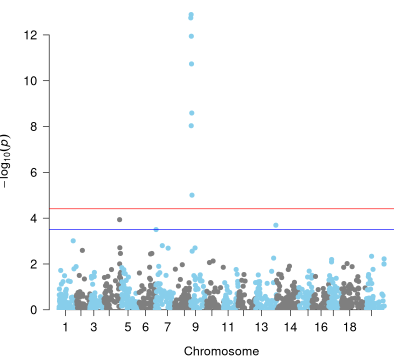
# Bonferonni Thresholdbonf <- round(-log10(0.05/length(unique(mlm$Marker))), 2)bonf## Console Output ## # [1] 4.41
# Benjamini-Hochberg Cutoff
calc_BHfdr <- function(tasselres, fdr) { # Takes the tassel results file and our chosen FDR and # creates a dataframe with the cutoff values of each phenotype bhsig <- unlist(lapply(unique(tasselres$Trait), function(x) { pvals <- droplevels(tasselres[which(tasselres$Trait == x), c(2, which(colnames(tasselres) == "p"))]) pvals <- pvals[order(pvals$p), ] pvals$pvalrank <- 1:nrow(pvals) pvals$bh <- (pvals$pvalrank/nrow(pvals))*fdr pvals$bhtest <- ifelse(pvals$p < pvals$bh, "SIG", "NOTSIG") pvals$p[max(pvals$pvalrank[which(pvals$bhtest == "SIG")])] })) out <- as.data.frame(list("Trait" = unique(tasselres$Trait), "LastPval" = bhsig, "Thresholds" = round(-log10(bhsig), 2))) return(out)}
BHthresholds <- calc_BHfdr(mlm, .05)BHthresholds### Console Output ### # Trait LastPval Thresholds# 1 Incid_2019 3.3127e-04 3.48# 2 BCT_Sev_2021 3.0447e-05 4.52
Manhattan and QQ-Plots
Now that we have our thresholds, we can put our plots together. Both Manhattan and QQ-plots can be created using the R package "qqman". However, it does require numeric chromosome labels which we can extract using a function for manipulating character strings from the "stringr" package. We will finish up this hands-on by extracting the list of significant markers for both thresholds.
xxxxxxxxxx### Visualizing Our Results ###
# Installs qqman package in RStudio. Should only need to run once.install.packages("qqman")install.packages("stringr")
# Loads the packageslibrary(qqman)library(stringr)
# The Manhattan plot requires numeric chromosome labelsmlm$ChrNumbers <- as.numeric(str_replace(mlm$Chr, "RH_CHR", ""))
par(mfrow = c(1, 1), mar = c(4.1, 4.1, 1, 1))# Switch to plot one trait at a time trait <- "Incid_2019"#trait <- "BCT_Sev_2021"
manhattan(mlm[which(mlm$Trait == trait & (!is.nan(mlm$p))), ],           chr = "ChrNumbers", bp = "Pos", p = "p", snp = "Marker",           col = c("skyblue", "grey50"),          suggestiveline = BHthresholds$Thresholds[which(BHthresholds$Trait == trait)], genomewideline = bonf,          cex = 1.5, cex.lab = 1.25, cex.axis = 1.25)
qq(mlm[which(mlm$Trait == trait & (!is.nan(mlm$p))), ]$p,   cex = 1.5, cex.lab = 1.25, cex.axis = 1.25)
### Getting Significant Marker List mlm$log10p <- -log10(mlm$p)
mlm$Marker[which(mlm$Trait == "Incid_2019" & mlm$log10p >= bonf)]### Console Output ### # [1] "rh_chr9_618812"  "rh_chr9_1150801" "rh_chr9_1250145" "rh_chr9_1407687"# [5] "rh_chr9_1648912" "rh_chr9_2008333" "rh_chr9_2302342"
mlm$Marker[which(mlm$Trait == "Incid_2019" & mlm$log10p >= BHthresholds$Thresholds[which(BHthresholds$Trait == "Incid_2019")])]### Console Output ### # [1] "rh_chr13_28096981" "rh_chr4_22215506"  "rh_chr9_618812"    "rh_chr9_1150801"  # [5] "rh_chr9_1250145"   "rh_chr9_1407687"   "rh_chr9_1648912"   "rh_chr9_2008333"  # [9] "rh_chr9_2302342"
Our Manhattan plot for Incid_2019 (Figure 8) includes both Bonferroni threshold (red) and Benjamini-Hochberg cutoff (blue) lines. Both include the supported peak of seven markers on Chromosome 9 (corresponding to Rpv33), however the Benjamini-Hochberg line also includes three other significant markers on chromosomes 4, 7, and 13. This is in contrast to the Manhattan plot for Sev_2021 where both thresholds only include the peak on Chromosome 9. Although this is the end of this hands-on, the next step would include looking through the annotation file of the reference genome at the positions of the QTL to see if there are any potential genes or gene families present that could be affecting our phenotype.
Figure 8: Manhattan Plot - Incid_2019
References
Bradbury, P. J., Zhang, Z., Kroon, D. E., Casstevens, T. M., Ramdoss, Y., and Buckler, E.S. 2007. TASSEL: Software for association mapping of complex traits in diverse samples. Bioinformatics 23:2633-2635. https://doi.org/10.1093/bioinformatics/btm308.
Zou, C., Sapkota, S., Figueroa-Balderas, R., Glaubitz, J., Cantu, D., Kingham, B. F., Sun, Q., and Cadle-Davidson, L. 2023. A multitiered haplotype strategy to enhance phased assembly and fine mapping of a disease resistance locus. Plant Physiology 193(4):2321–2336. https://doi.org/10.1093/plphys/kiad494.