Genetics Workshop
and QTL Mapping
VitisGen3 Postdoctoral Research Associate
Cornell Institute of Biotechnology
Introduction
This hands-on is the final of three exercises as part of the 2024 VitisGen3 Genetics Workshop. The goal of this workshop is to help VitisGen3 participating breeding programs and researchers learn how to work with their own rhAmpSeq data from acquisition to QTL. However, some of these tools and methods can also be transferable to other sequence types. Throughout all the hands-on exercises, we will be working with the sequence and phenotype data of the Vitis x doaniana 'PI 588149' x 'Chardonnay' F~1~ family from Zou et al., 2023 that was used to map a novel grapevine downy mildew resistance locus, Rpv33.
In this hands-on, we will focus on creating linkage maps using Lep-MAP3 (Rastas, 2017) on the BioHPC following some marker filtering in Tassel. Then, we will take a look at the quality of our linkage maps in RStudio before QTL mapping use the R package "R/qtl". By the end of this hands-on you should have a better understanding of how to create linkage maps and use them to map QTL.
Required Programs
RStudio
Access through the BioHPC server (recommended to follow along with the hands-on)
Users outside Cornell need to follow the instructions (section 3.4.1) at https://biohpc.cornell.edu/doc/vitisgen3_ws/vitisgen3ws_prep.html
All users will need to login to Linux command line of cbsuvitisgen2.biohpc.cornell.edu, run this command. This is to setup up rstudio cache directory. You just need to do it once.
xxxxxxxxxx/programs/rstudio_server/mv_dirThen copy/paste this link (http://cbsuvitisgen2.biohpc.cornell.edu:8016) into your browser and log in with your BioHPC credentials.
You can also install R and RStudio on your local machine
Download at https://posit.co/download/rstudio-desktop/ and follow the instructions
Tassel 5.0
Install on your local machine
Download at https://www.maizegenetics.net/tassel and follow the instructions
Citation: Bradbury et al., 2007
Linkage Map Construction
In this section of the hands-on, we will start by preparing a new .vcf file on the BioHPC. Once we get it filtered down to the highest quality markers, we will run imputation to fill in any missing genotype calls. After double checking our pedigree.txt file, we will run through the 'Lep-MAP3' pipeline before formatting the map for 'R/qtl'.
Preparing Our VCF
As in the last hands-on, we will begin by generating a new .vcf file. This file will differ from the one created for GWAS as it will only have a single set of consensus genotype calls and won't include the contaminant sample we identified in the second hands-on. Another relevant difference is that we also care about the pedigree.txt file that 'to_lep_map.pl' creates alongside the .vcf. Slicing the hap_genotype file again to remove unneeded taxa also will save us time later when checking the pedigree.txt file for 'Lep-MAP3'. I've once again provided the family list that we will be using in the "/workdir/VG3Workshop_23" directory. Once we have the files, transfer them to a local machine to work first with the .vcf in Tassel before checking our pedigree.txt file.
x### Preparing our Linkage Map VCF ###
# calling our working directory on the BioHPCcd /workdir/$USER/Hands-OnWorkthrough#cd /workdir/$USER
# copy the hap_genotype and family files to your working directory cp /workdir/VG3Workshop_23/hap_genotype ./cp /workdir/VG3Workshop_23/linkagemaptaxa ./
/workdir/amplicon/slice.py -i ./ -o hands-on3 -f linkagemaptaxa -a 0.001
to_lep_map.pl -g hands-on3/hap_genotype -f 0.001 -m 1,2 -p 3,4 -j 'PI588678' -k 'Chardonnay' -n Hands-On3_Family# ps: if this prints a bunch of warnings into the console, that is normal and everything is fine.
Opening Files in Tassel
Let's get the genotype .vcf open in Tassel.
Open Tassel on your local machine
Click "File" then "Open As..." in the top left corner
Leave "Format" as "Make Best Guess"
For the .vcf file
Select both "Sort Positions" and "Keep Depth" before clicking "Ok"
Select the .vcf file you want to open then click "Open"
Filtering and Imputation
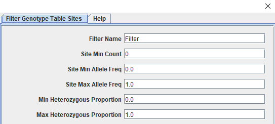
The genotype table should have 216 taxa and 1958 sites. These sites have had minimal filtering as part of the genotype calling step and need to filtered down to only those that are informative and high quality. We will start by splitting away the parent genotype calls before filtering the progeny for call rate (missingness), minor allele frequency, and polymorphic sites. Some additional filtering will occur later as we work through the 'Lep-MAP3' pipeline. Our last step before saving files will be to impute missing data using the LD-kNNi (Linkage Disequilibrium k-means Nearest Neighbor imputation) method described in Money et al., 2015 that has been incorporated in the Tassel software. The way filtering works in Tassel is through a specific window accessed by clicking "Filter" followed by "Filter Genotype Table Sites" (or "Filter Genotype Table Taxa") depending on our goals. The screenshots below shows the taxa filtering window (Figure 1) and the top section of the sites window (Figure 2).
Figure 1: Tassel's Filter Taxa Window
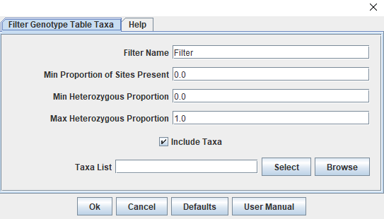
Figure 2: Tassel's Filter Sites Window
Filtering the Genotype Table:
Separate the parents and progeny
Create parent table
Make sure unfiltered genotype table is highlighted
Select "Filter", "Filter Genotype Table Taxa"
Next to the "Taxa List" box, click "Select"
Highlight both parents ("Chardonnay" and "PI588678"); click "Add ->"
Click "Capture Selected"; then "Ok"
Create progeny table
Make sure unfiltered genotype table is highlighted
Repeat steps 1-3 from parent table
Click "Capture Unselected"; then "Ok"
Filter sites from the progeny table (214 taxa; 1958 sites)
The following table presents the steps for filtering sites after you access the "Filter Genotype Table Sites" window, showing the arguments and the affect of each filter so you can follow along. I like to do them one at a time so I can keep track of how many sites are filtered at each step in case there are downstream issues.
| Filter Target | Tassel Parameter | Value | Sites Remaining |
|---|---|---|---|
| 90% Call Rate (214 taxa * .9 = 192.6) | Site Min Count | 193 | 1729 |
| Minor Allele Frequency > 0.05 | Site Min Allele Freq Site Max Allele Freq | 0.05 0.95 | 1643 |
| Polymorphic Sites | Min Heterozygous Proportion Max Heterozygous Proportion | 0.01 0.99 | 975 |
Merge progeny and parent table
Highlight both filtered progeny table and the unfiltered parent table
Select "Data", "Merge Genotype Tables"
New table should have 216 taxa; 1958 sites
Redo missingness (call rate) filter from above
Table should now have 216 taxa; 975 sites
Impute missing sites
Highlight merged and filtered genotype table
Select "Impute", "LD KNNi Imputation"; Click "Ok"
Save files out of Tassel
For this hands-on, we will only use the imputed vcf file going forward but I always like to save a .vcf of the filtered, unimputed genotype table as well just in case.
Highlight imputed genotype table
Select "File", "Save as..."
Name the file; Set "Format" to "VCF"; Click "Ok"
Checking the Pedigree File
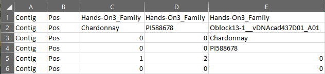
The pedigree.txt file is an important input file for 'Lep-MAP3'. It provides the software information about the family and it will build onto it as we work through the pipeline. Luckily, 'to_lep_map.pl' generates a properly formatted pedigree file ending in pedigree.txt. If we had filtered any taxa from our .vcf while in Tassel, we would need to remove them from the pedigree file as well. Even though we did not, it is good to make sure that the parents are properly identified and there weren't any errors when it was generated. Since it is a tab-delimited .txt file, we will open it using Excel's Text Import Wizard.
Open Excel
Click "Open Other Workbooks"
Navigate to the directory where you saved your pedigree file
Click "All Excel Files" in the lower right corner and change it to "All Files (*.*)"
Your phenotype file should be visible now, double-click it
In the Text Import Wizard, choose "Delimited"
Click "Finish"
The pedigree file that opens should have six rows and as many columns as taxa plus two (Figure 3). The first columns should appear as they do in Figure 3. A more complete breakdown of each row is covered in the Section 3 lecture. There are a few things we want to make sure are correct here. For the dataset provided with the hands-on, the parents are "PI588678" (seed parent) and "Chardonnay" (pollen parent) and they should be indicated as the female (2) and male (1) parents in row 5, respectively. Another thing to ensure is that the names of the parents given in row 2 of columns C and D match those given for every progeny in rows 3 and 4. Since our pedigree file is correct, we don't need to make any changes. If you aren't following along exactly or found an error, make sure you transfer the corrected file back to the BioHPC as we will need it and the imputed .vcf for 'Lep-MAP3'.
Figure 3: Pedigree File for Hands-On 3
Executing the Lep-MAP3 Pipeline
We are now ready to start constructing our linkage map. Make sure you have both your imputed .vcf file and the checked pedigree file in your working directory on the BioHPC. The 'Lep-MAP3' pipeline itself is fairly linear. There are a series of modules that we will go through to produce our linkage map with the occasional need to tweak some arguments depending on the map. There are four main steps in the pipeline and each are discussed briefly in the Section 3 lecture and at full in the 'Lep-Map3' documentation that can be found here. There's an active forum at this link as well if you run into any issues beyond working with your own data.
'Lep-Map3' Pipeline Modules
ParentCall2
Used to call (possible missing or erroneous) parental genotypes and sets up input files for rest of pipeline.
Filtering2
Handles additional marker filtering, we are primarily using it to filter for segregation distortion
SeparateChromosome2
Assigns markers to linkage groups
OrderMarkers2
Orders the markers within each linkage group by maximizing the likelihood of the data given the order.
xxxxxxxxxx# Call working directory on the BioHPC
cd /workdir/$USER
### 1. ParentCall2 ### java -cp /programs/Lep-MAP3/bin/ ParentCall2 data = Hands-On3_Family.lepmap3.pedigree.txt vcfFile = Hands-On3_Filtered.vcf > post.call
## Console Output ## # No grandparents present in family Hands-On3_Family# Number of individuals = 216# Number of families = 1# Number of called markers = 975 (867 informative)# Number of called Z/X markers = 0
### 2. Filtering2 ###java -cp /programs/Lep-MAP3/bin/ Filtering2 data = post.call removeNonInformative=1 dataTolerance=0.0001 > filtpost.call
## Console Output ## # chi^2 limits are 15.1357421875, 18.419921875, 21.107421875# No grandparents present in family Hands-On3_Family# Number of individuals = 216# Number of families = 1# Number of markers = 975
### 3. SeparateChromosomes2 ###java -cp /programs/Lep-MAP3/bin/ SeparateChromosomes2 data=filtpost.call lodLimit=5 sizeLimit=5 > map.txt
## Console Output ### Loading file# No grandparents present in family Hands-On3_Family# Number of individuals = 216# Number of families = 1# File loaded with 592 SNPs# Number of individuals = 216 excluding grandparents# Number of families = 1# computing pairwise LOD scores# 123456789 done!#  done!# number of LGs = 22 singles = 8# Removing LG 22 (as too small) with size 3# Number of LGs = 21, markers in LGs = 581, singles = 11
### 3-1. Distribution of Linkage Group Size ### sort map.txt|uniq -c|sort -n# The console output from this shows the number of markers in each linkage # group sorted from least to most (ex: linkage group 1 has 43 markers while # linkage group 20 has 7). Linkage group 0 are the markers that couldn't be # placed in another linkage group and will be dropped
### Console Output ### #  1 #java SeparateChromosomes2  data=filtpost.call lodLimit=5 sizeLimit=5#  7 20#  7 21# 11 0# 12 19# 17 18# 24 17# 25 15# 25 16# 26 13# 26 14# 27 10# 27 11# 27 12# 31 9# 32 7# 32 8# 33 6# 36 5# 41 3# 41 4# 42 2# 43 1
### 4. OrderMarkers2 ###java -cp /programs/Lep-MAP3/bin/ OrderMarkers2 data=filtpost.call sexAveraged=1 map=map.txt > order.txt
# There will be a lot of output to the console here. It should look like it# is iterating through each linkage group to find the best# order of markers for each one.
We now have a linkage map (yay). The last thing to do is extract the information we need about our map so we can get it ready for 'R/qtl'. Once these files are saved, we will shift to working with them on the RStudio server.
xxxxxxxxxx### Convert order.txt to genotype.txt ### # The genotype.txt is more human readible and is closer# to the format we need for R/qtlawk -vfullData=1 -f map2genotypes.awk order.txt > genotypes.txt
### Get Marker Names and Linkage Groups # Lep-MAP3 assigns a number to each marker at the beginning# of the pipeline and that number is what is shown in the # genotypes.txt file. We need to extract that order so we can # reintroduce the marker names.
awk '(NR>=7)' filtpost.call|cut -f 1,2 > snpnames.txtpaste snpnames.txt map.txt > snplgs.txt
Formatting the Map for R/qtl
We have a few things to do before we can get to QTL mapping. The first thing is getting it reformatted for 'R/qtl' which we can handle in RStudio. In the next code block, we will read in all the necessary files, replace the taxa and marker name placeholders with human informative names, code the genotype calls, and then reformat the map as a comma-separated .csv file. The only required package for this section is "stringr" which helps with manipulating character strings. Once it's ready, we will save it out so we can read it back in as a proper 'cross' object that 'R/qtl' can use.
xxxxxxxxxx### Set working directory ###
setwd("/workdir/dgw65/Hands-OnWorkthrough")
### Install / load packages ##
#install.packages("stringr")library(stringr)
### Read in genotypes.txt ### geno <- read.table("genotypes.txt", header = F, sep = "\t")[-c(1, 3:6), -c(5:6)]
### Grabbing Genotype Names from Pedigree File ### genoids <- as.character(read.table("Hands-On3_Family.lepmap3.pedigree.txt", header = F, sep = "\t")[2 , -c(1:4)])
### Replacing Column names with taxa idcolnames(geno) <- c(geno[1, 1:4], genoids)geno <- geno[-1, ]
### Replacing Marker and Chromosome Names ###
markerids <- read.table("snplgs.txt", header = F, sep = "\t", skip = 1, col.names = c("MARKER", "PHYS_POS", "LG"))markerids$MARKNUM <- 1:nrow(markerids)markerids$ID <- paste(markerids$MARKER, markerids$PHYS_POS, sep = "_")
geno$CHR <- unlist(lapply(geno$MARKER, function(x) {  markerids$LG[which(markerids$MARKNUM == x)]}))
geno$MARKER <- unlist(lapply(geno$MARKER, function(x) {  markerids$ID[which(markerids$MARKNUM == x)]}))
table(geno$CHR)#  1  2  3  4  5  6  7  8  9 10 11 12 13 14 15 16 17 18 19 20 21 # 43 43 41 40 36 33 32 32 31 29 29 28 26 26 25 25 24 18 13  8  7
### Coding Genotype Calls ###
GenotypeCoding <- function(genofile, startcol = 5, fourway = F) {  # Takes the 'geno' R object we have been working with   # and translates its Lep-MAP3 coding into R/qtl coding.   if (fourway == F) {       for (row in seq(1, nrow(genofile))) {        for (col in seq(startcol, ncol(genofile))) {           genofile[row, col] <- ifelse(genofile[row, col] == "1 1", "AA",                                        ifelse(genofile[row, col] %in% c("1 2", "2 1"), "AB",                                              ifelse(genofile[row, col] == "2 2", "BB", "PROB")))        }      }  } else {     for (row in seq(1, nrow(genofile))) {      for (col in seq(startcol, ncol(genofile))) {         genofile[row, col] <- ifelse(genofile[row, col] == "1 1", "AC",                                      ifelse(genofile[row, col] =="1 2", "AD",                                            ifelse(genofile[row, col] =="2 1", "BC",                                                   ifelse(genofile[row, col] == "2 2", "BD", "PROB"))))      }    }  }  return(genofile)}
codedgeno <- GenotypeCoding(geno)
# For four-way cross coding # codedgeno <- GenotypeCoding(geno, fourway = T)
### Final Formatting ###
rownames(codedgeno) <- codedgeno$MARKERcodedgeno$MARKER <- NULLcodedgeno$CHR <- as.character(codedgeno$CHR)
codedgeno <- t(codedgeno)codedgeno <- as.data.frame(cbind(rownames(codedgeno), codedgeno))rownames(codedgeno) <- NULL
### Removing duplicate map positions # codedgeno <- codedgeno[-2, ]
### Final touches ### colnames(codedgeno)[1] <- "TaxaID"codedgeno[1:2, 1] <- c("", "")
write.csv(codedgeno, "Hands-On3_map.csv", row.names = F, quote = F)
Checking Map Quality
It's time to read our linkage map into 'R/qtl'. Before we can try mapping with it however, we want to make sure we have a good quality map. In this section, we will check the quality by first plotting the map to get a sense of the gaps and cM lengths. We will then take a look at the recombination frequency within and among linkage groups and check their marker order by comparing it to the physical positions in the reference genome.
Reading in the Linkage Map
We will then use 'read.cross' to bring our map into 'R' and address some co-locating markers.
xxxxxxxxxx### Set working directory
setwd("/workdir/[your BioHPC username]")
### Install / load packages
# install.packages('qtl')# install.packages('stringr')
library(qtl)library(stringr)
### Read in linkage map ###
map <- read.cross("csv", file = "Hands-On3_map.csv", estimate.map = F,                  genotypes = c("AA", "AB", "BB"), alleles = c("A", "B"))### Console Output ### # --Read the following data:#   214  individuals# 581  markers# 1  phenotypes# --Cross type: f2 # Warning message:#   In summary.cross(cross) :#   Some markers at the same position on chr 1,2,3,4,5,6,7,8,9,10,11,12,13,14,15,16,17,20; use jittermap()
map <- jittermap(map)
Looking at the Map
Let's take a look at the map and get some summary statistics.
xxxxxxxxxxpar(mfrow = c(1, 1))plotMap(map)
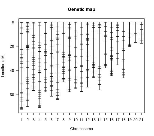
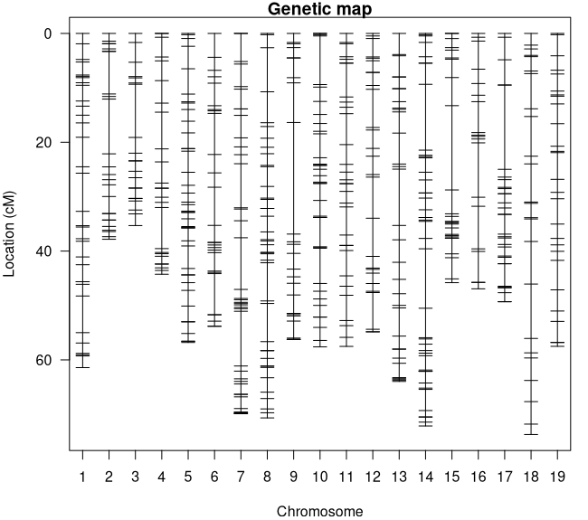
summary.map(map)### Console Output ### # n.mar length ave.spacing max.spacing# 1 43 72.1 1.7 12.1# 2 42 69.9 1.7 10.1# 3 41 56.8 1.4 4.6# 4 41 70.7 1.8 8.1# 5 36 57.6 1.6 8.9# 6 33 61.4 1.9 7.0# 7 32 64.0 2.1 10.3# 8 32 49.3 1.6 15.5# 9 31 57.5 1.9 6.2# 10 27 54.8 2.1 7.6# 11 27 57.5 2.2 5.4# 12 27 53.8 2.1 7.6# 13 26 45.8 1.8 15.5# 14 26 56.2 2.2 20.5# 15 25 37.8 1.6 10.1# 16 25 44.3 1.8 7.6# 17 24 35.3 1.5 9.8# 18 17 46.1 2.9 7.8# 19 12 20.1 1.8 5.7# 20 7 16.8 2.8 7.8# 21 7 17.7 2.9 4.1# overall 581 1045.6 1.9 20.5I see a couple things to note here. The first is that we don't have any linkage groups that are too long (all are less than 100 cM) (Figure 4) and our overall map distance is reasonable for our genome size. The longest linkage group is LG 1 at 72.1 cM which makes sense because it has the most markers (43). The largest gap in the map is on linkage group 14 at 20.5 cM however that isn't large enough to be worried about, especially since its in the middle of the LG. What does need to be addressed is that we have 21 linkage groups for our 19 Vitis chromosomes. This likely means that we have one or more chromosomes that were split by 'Lep-MAP3'. Let's see if we can't figure out which ones by cross-referencing the linkage groups with the chromosome positions in the marker names.
Figure 4: Linkage Map Plot
xxxxxxxxxxchrIDbymarks <- function(cross_obj) {     # Generates a table that cross-references the chromosome     # from the marker names with their assigned linkage group  lgnames <- c()  snpnames <- c()  for (chr in names(map$geno)) {    mkrs <- markernames(cross_obj, chr = chr)    mkrs <- sub("CHR", "", word(mkrs, 2, sep = "_"))    mkrs <- as.numeric(mkrs)        snpnames <- append(snpnames, mkrs)    lgnames <- append(lgnames, as.numeric(rep(chr, length(mkrs))))  }  return(table(snpnames, lgnames))}
chrIDbymarks(map)### Console Output ### #     lgnames# snpnames  1  2  3  4  5  6  7  8  9 10 11 12 13 14 15 16 17 18 19 20 21      # 1   0  0  0  0  0 33  0  0  0  0  0  0  0  0  0  0  0  0  0  0  0      # 2   0  0  0  0  0  0  0  0  0  0  0  0  0  0 25  0  0  0  0  0  0      # 3   0  0  0  0  0  0  0  0  0  0  0  0  0  0  0  0 24  0  0  0  0      # 4   0  0  0  0  0  0  0  0  0  0  0  0  0  0  0 25  0  0  0  0  0      # 5   0  0 41  0  0  0  0  0  0  0  0  0  0  0  0  0  0  0  0  0  0      # 6   0  0  0  0  0  0  0  0  0  0  0 27  0  0  0  0  0  0  0  0  0      # 7   0 42  0  0  0  0  0  0  0  0  0  0  0  0  0  0  0  0  0  0  0      # 8   0  0  0 41  0  0  0  0  0  0  0  0  0  0  0  0  0  0  0  0  0      # 9   0  0  0  0  0  0  0  0  0  0  0  0  0 26  0  0  0  0  0  0  0      # 10  0  0  0  0 36  0  0  0  0  0  0  0  0  0  0  0  0  0  0  0  0      # 11  0  0  0  0  0  0  0  0 31  0  0  0  0  0  0  0  0  0  0  0  0      # 12  0  0  0  0  0  0  0  0  0 27  0  0  0  0  0  0  0  0  0  0  0      # 13  0  0  0  0  0  0 32  0  0  0  0  0  0  0  0  0  0  0  0  0  0      # 14 43  0  0  0  0  0  0  0  0  0  0  0  0  0  0  0  0  0  0  0  0      # 15  0  0  0  0  0  0  0  0  0  0  0  0 26  0  0  0  0  0  0  0  0      # 16  0  0  0  0  0  0  0  0  0  0  0  0  0  0  0  0  0  0 12  7  0 <- TWO LGs      # 17  0  0  0  0  0  0  0 32  0  0  0  0  0  0  0  0  0  0  0  0  0      # 18  0  0  0  0  0  0  0  0  0  0  0  0  0  0  0  0  0 17  0  0  7 <- TWO LGs      # 19  0  0  0  0  0  0  0  0  0  0 27  0  0  0  0  0  0  0  0  0  0
Looking through this table we can see that chromosomes 16 and 19 have been split into two linkage groups each: chromosome 16 on LGs 19 and 20; chromosome 18 on LGs 18 and 21. Let's see if we can figure out why they were split by looking at a few more things.
Recombination Frequency
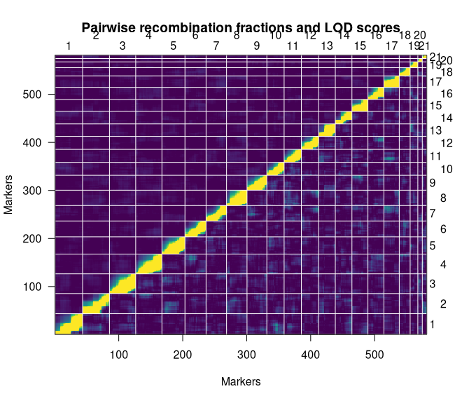
The recombination frequency plot shows the pairwise LOD scores for linkage and recombination frequencies of every marker in the linkage map. The ideal plot will be brightest along the diagonal.
xxxxxxxxxxplotRF(map, what = "both", zmax = 5)We can see that we have a stable map given the strength of linkage along the diagonal (Figure 5). It is also worth noting that we do not see strong linkage between our split chromosomes. This likely suggests that there weren't enough high-quality markers keep it together. Our last plot can confirm that for us.
Figure 5: Recombination Frequency Plot
Checking Marker Order
Unlike the last two plots, there aren't any functions in 'R/qtl' that we can use to generate the genetic (cM) by physical (Mb) distance plots we need to check our marker order. We will extract the information we need from the 'cross' object and look at our split LGs before plotting the rest.
xxxxxxxxxxGetPhysxcM <- function(mapobj) {    # Goes LG by LG, splitting the marker names to get their    # physical positions and creates a new list for plotting  nexus <- list()  counter <- 1  for (chr in chrnames(mapobj)) {     marks <- unlist(mapobj$geno[[chr]]$map)    catch <- data.frame(list("IDs" = names(marks),                              "cmdist" = as.numeric(marks)))    catch$physdist <- word(catch$IDs, -1, sep = "_")    catch$physdist <- as.numeric(catch$physdist)/1e6    nexus[[counter]] <- catch    counter <- counter + 1  }  return(nexus)}
physxcm <- GetPhysxcM(map)
par(mfrow = c(2, 2), mar = c(4, 4, 1, 1))for (i in seq(18, 21)) {   plot(physxcm[[i]]$physdist, physxcm[[i]]$cmdist,         pch = 20, ylab = "Genetic (cM)", xlab = "Physical (Mb)")  legend("topleft", paste("LG", as.character(i)),          bty = "n", cex = 1.5, inset = -0.05)}
Figure 6: Marker Order Plots
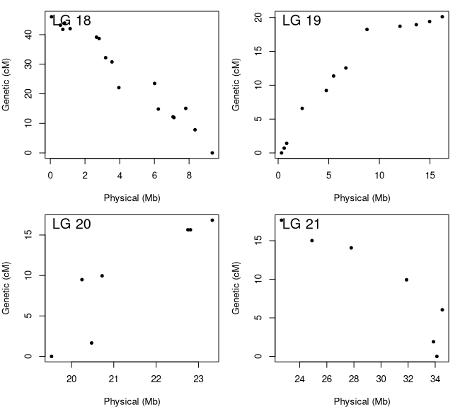
Figure 6 shows the genetic by physical distance plots for the four LGs that comprise chromosomes 16 (LG 19 and 20) and 18 (LG 18 and 21). We can say for sure now that there weren't enough markers to bridge the gap. For chromosome 18, the two linkage groups contain markers that are at least 15 Mb apart while chromosome 16 has a smaller gap that is closer to 5 Mb. Since we know they are from the same chromosome, we can merge them together but need to make sure we have them oriented correctly. We can do this by reversing the order of the linkage groups with negative slopes. The orientation of the linkage groups is somewhat random so your 'flip.order' may be different then mine. Once we get our LGs merged, we will check out the marker order plots for all the LGs (Figure 7) and then ensure they are all oriented to match the reference genome.
xxxxxxxxxx# Reversing the marker ordermap <- flip.order(map, chr = c(18, 21))
# Let's rerun this script to make sure we did it correctlyphysxcm <- GetPhysxcM(map)par(mfrow = c(2, 2), mar = c(4, 4, 1, 1))for (i in seq(18, 21)) {   plot(physxcm[[i]]$physdist, physxcm[[i]]$cmdist,         pch = 20, ylab = "Genetic (cM)", xlab = "Physical (Mb)")  legend("topleft", paste("LG", as.character(i)),          bty = "n", cex = 1.5, inset = -0.05)}
# The ASMap package has an easy function we can use to merge LGs# install.packages('ASMap')library(ASMap)
# Merging the linkage groups with a 10 cM gapmap <- mergeCross(map, merge = list("22" = c(19, 20), "23" = c(18, 21)), gap = 10)
# Quickly renaming LGs names(map$geno) <- seq(1:19)
# now lets look at the marker order plots for all the LGsphysxcm <- GetPhysxcM(map)par(mfrow = c(4, 5), mar = c(4, 4, 1, 1))for (i in seq(1, 19)) {   plot(physxcm[[i]]$physdist, physxcm[[i]]$cmdist,         pch = 20, ylab = "Genetic (cM)", xlab = "Physical (Mb)")  legend("topleft", paste("LG", as.character(i)),          bty = "n", cex = 1.5, inset = -0.05)}
# Flipping the orientation of some LGsmap <- flip.order(map, chr = c(2, 6, 10:12, 15, 17))
# Rerunning the plot script one final time to make sure we have itphysxcm <- GetPhysxcM(map)par(mfrow = c(4, 5), mar = c(4, 4, 1, 1))for (i in seq(1, 19)) {   plot(physxcm[[i]]$physdist, physxcm[[i]]$cmdist,         pch = 20, ylab = "Genetic (cM)", xlab = "Physical (Mb)")  legend("topleft", paste("LG", as.character(i)),          bty = "n", cex = 1.5, inset = -0.05)}
Figure 7: Final Marker Order Plots

Now that we can see all the linkage groups, it's obvious that some are nicer than others but none are bad enough to warrant any further action. We are officially done with our map QC.
Saving the Map
As we transition to QTL mapping, we will make one final adjustment to our linkage map that will help us interpret our QTL results. We will finish up the map quality section by renaming our linkage groups to match their marker's chromosome before saving the finished map (Figure 8).
xxxxxxxxxxlgs <- unlist(lapply(1:19, function(x) {# Goes LG by LG and determines the chromosome from the # marker names and saves them to a list  split <- table(word(markernames(map, x), 2, sep = "_"))  if (length(split) == 1) {    as.numeric(str_replace(names(split), "CHR", ""))  } else {    maxchr <- str_replace(names(split), "chr", "")[which.max(split)]    as.numeric(str_replace(maxchr, "CHR", ""))  }}))
# Renames the LGsnames(map$geno) <- lgs
# Sort the LGs so they're in ordermap$geno <- map$geno[match(1:19, as.numeric(names(map$geno)))]
# Plotting the final map par(mfcol = c(1, 1), mar = c(4, 4, 1, 1))plotMap(map)
### Saving Linkage Map ### write.cross(map, filestem = "Hands-On3_Map4QTL", format = "csv")
Figure 8: Final Linkage Map
QTL Mapping
We have all the pieces we need for QTL mapping. In this section, we will combine our finished linkage map with our phenotype data (prepared in hands-on 2), calculate the genotype probabilities for our map, run our QTL models, and finish the hands-on by getting the effect sizes of our QTL. As a reminder, we are using two phenotypes that Zou et al., 2023 used to map Rpv33 in this family.
Reading in the Linkage Map
Let's get started by reading our map into RStudio.
xxxxxxxxxx### Set working directory
setwd("/workdir/[your BioHPC username]")
### Install / load packages
# install.packages('qtl')# install.packages('stringr')library(qtl)library(stringr)
### Reading map into R ###
map <- read.cross("csv", file = "Hands-On3_Map4QTL.csv", estimate.map = F,                  genotypes = c("AA", "AB", "BB"), alleles = c("A", "B"))### Console Output ### # --Read the following data:#   214  individuals#   581  markers#   1  phenotypes# --Cross type: f2
Incorporating the Phenotype Data
Now let's incorporate our phenotype data in with our map. Before we can, however, we need to not only ensure that both map and phenotype data have the same set of taxa but they are also in the same order. If you have followed along from hands-on 2, feel free to use your saved phenotype file (before it was reformatted for Tassel), otherwise the one I generated is available in the "/workdir/VG3Workshop_23" directory with the other files. This phenotype file should have two traits, grapevine downy mildew incidence ratings from 2019 (Incid_2019) and severity ratings from 2021 (BCT_Sev_2021). During hands-on 2, we determined that the incidence ratings could not be normalized and were left untransformed while the severity ratings did normalize following Box-Cox transformation.
xxxxxxxxxx### Reading In Phenotype Data ###
pheno <- read.table("/workdir/VG3Workshop_23/Phenotypes4Mapping.txt", header = T)
# Checking if there are phenotyped Taxa not in the mappheno$TaxaID[which(!(pheno$TaxaID %in% map$pheno$TaxaID))]## Console Output ## # [1] "Oblock14-23__vDNAcad438D02_G09"
# This is the contaminant sample we identified in Hands-On 2# Let's remove it from the phenotype file todrop <- pheno$TaxaID[which(!(pheno$TaxaID %in% map$pheno$TaxaID))]pheno <- droplevels(pheno[which(!(pheno$TaxaID %in% todrop)), ])
# Let's check if there are any map taxa that weren't phenotypedmap$pheno$TaxaID[which(!(map$pheno$TaxaID %in% pheno$TaxaID))]## Console Output ## # factor(0) # 214 Levels: Oblock13-1__vDNAcad437D01_A01 ... Oblock15-9__vDNAcad439D03_B04
# Both have the same set of 214 taxa
# Now let's make sure that the taxa in the phenotype file are# in the same order as the taxa in the linkage map  pheno <- pheno[order(match(pheno$TaxaID, map$pheno$TaxaID)), ]
# Add the phenotype data to the mapmap$pheno <- pheno
# Let's talk a look at the map's phenotype data head(map$pheno)## Console Output ###                           TaxaID Incid_2019 BCT_Sev_2021# 1  Oblock13-1__vDNAcad437D01_A01         20     225.7453# 2 Oblock13-10__vDNAcad437D01_B02         30     540.1106# 3 Oblock13-11__vDNAcad437D01_C02          0     151.4503# 4 Oblock13-12__vDNAcad437D01_D02          5     637.9057# 5 Oblock13-13__vDNAcad437D01_E02          5     540.1106# 6 Oblock13-14__vDNAcad437D01_F02          0     508.8822
Calculating Genotype Probabilities
This is a crucial step in linkage mapping as it uses a model to calculate the probabilities of the underlying genotypes given the expected error rate. For rhAmpSeq, this error probability is 1e-4 as shown in the code block. The 'step' argument is also important as 'calc.genoprob' will introduce pseudo-markers every 'step = x' cM and calculate probabilities for them as well. A heads-up on 'calc.genoprob', if you end up getting slightly different results than I do in the below sections, 'calc.genoprob' is the culprit. As it's estimating probabilities each time it's run, it may produce slightly different estimates which can impact whether or not a LOD score passes our threshold. This becomes more prominent if you are dealing with weaker effect size QTL.
xxxxxxxxxx# Calculating Genotype Probabilities #
map <- calc.genoprob(map, step = 10, off.end = 0.0, error.prob = 1.0e-4,                      stepwidth = "fixed", map.function = "kosambi")
QTL Mapping
We are finally ready to do some trait mapping. As was mentioned above, we are working with two sets of ratings that have different relationships with normality. Therefore, we will need to use different types of QTL models and, as a further comparison, we will be running two QTL models for each trait. For our approximately normal, Box-Cox transformed severity ratings from 2021, we will be using the normal models from both 'scanone' (single QTL model) and 'cim' (multiple QTL model) functions. However since the incidence ratings from 2019 resisted transformation to normality, we will be using the "np" (non-parametric) and "2part" models from 'scanone'. You can find more information about these models in the 'R/qtl' manual linked here. As we are running our models for each trait, we will also be running the permutation tests to get our 5 and 10% LOD significance thresholds. We will finish up by plotting our results and identifying the peak marker and position of our QTL.
BCT_Sev_2021
xxxxxxxxxx### Running QTL Models and Permutations ###
sev_cim <- cim(map, pheno.col = which(colnames(map$pheno) == "BCT_Sev_2021"), method = "hk")sev_cim_perm <- cim(map, pheno.col = which(colnames(map$pheno) == "BCT_Sev_2021"), method = "hk", n.perm = 1000)# Should take a little time to run
sev_scan1 <- scanone(map, pheno.col = which(colnames(map$pheno) == "BCT_Sev_2021"), model = "normal", method = "hk")sev_scan1_perm <- scanone(map, pheno.col = which(colnames(map$pheno) == "BCT_Sev_2021"), model = "normal", method = "hk", n.perm = 1000)# Should run faster than cim
summary(sev_cim_perm)# LOD thresholds (1000 permutations)# [,1]# 5% 4.55# 10% 4.05
summary(sev_scan1_perm)# LOD thresholds (1000 permutations)# lod# 5% 3.66# 10% 3.34
par(mfcol = c(1, 1), mar = c(4, 4, 1, 1))# Plots both qtl models where cim is black; scanone is blueplot(sev_cim, sev_scan1, col = c("black", "cyan3"), ylim = c(-0.05, (max(sev_scan1[ , 3], sev_cim[, 3], as.numeric(summary(sev_cim_perm)), as.numeric(summary(sev_scan1_perm))) * 1.05)))# Add the 5% LOD threshold for both models; color matchedabline(h = c(as.numeric(summary(sev_cim_perm))[1], as.numeric(summary(sev_scan1_perm))[1]), col = c("black", "cyan3"), lw = 3)# Add the 10% LOD threshold for both models; color matchedabline(h = c(as.numeric(summary(sev_cim_perm))[2], as.numeric(summary(sev_scan1_perm))[2]), col = c("black", "cyan3"), lw = 3)
# Both models met the 10% LOD threshold however the single QTL# model nearly met the 5% LOD
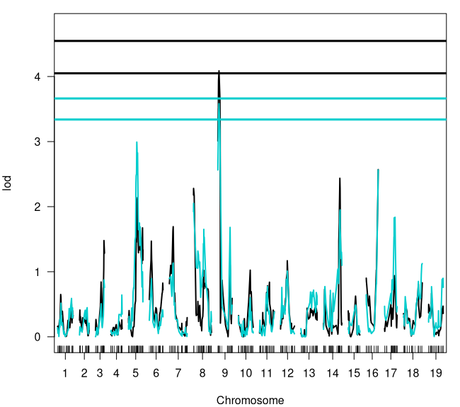
summary(sev_scan1)### Console Output ### # chr pos lod# RH_CHR1_20843669 1 54.996 0.590# RH_CHR2_7588304 2 29.977 0.448# RH_CHR3_15846197 3 33.164 0.874# RH_CHR4_23092663 4 43.085 0.643# RH_CHR5_10046422 5 32.654 2.992# RH_CHR6_4282333 6 7.967 0.895# RH_CHR7_7162026 7 15.057 1.134# RH_CHR8_1222997 8 0.234 2.051# RH_CHR9_1464217 9 4.508 3.583 <- Our QTL# RH_CHR10_10923726 10 45.955 0.602# RH_CHR11_8650142 11 31.184 0.774# RH_CHR12_8801535 12 26.411 1.012# RH_CHR13_16754260 13 49.985 0.718# RH_CHR14_27856994 14 65.189 1.951# RH_CHR15_12844486 15 28.766 0.490# RH_CHR16_23327502 16 46.933 2.563# RH_CHR17_8608505 17 41.145 1.838# RH_CHR18_34123552 18 73.711 1.125# RH_CHR19_21589986 19 56.804 0.899
### BCT_Sev_2021 QTL ### # Peak Marker: RH_CHR9_1464217# Chromosome: 9# Position: 4.508Figure 9: BCT_Sev_2021 QTL Results
Incid_2019
xxxxxxxxxx### Running QTL Models and Permutations ###
incid_np <- scanone(map, pheno.col = which(colnames(map$pheno) == "Incid_2019"),                     model = "np")incid_np_perm <- scanone(map, pheno.col = which(colnames(map$pheno) == "Incid_2019"),                         model = "np", n.perm = 1000)
incid_2p <- scanone(map, pheno.col = which(colnames(map$pheno) == "Incid_2019"),                     model = "2part")incid_2p_perm <- scanone(map, pheno.col = which(colnames(map$pheno) == "Incid_2019"),                         model = "2part", n.perm = 1000)
summary(incid_np_perm)# LOD thresholds (1000 permutations)#      lod# 5%  3.59# 10% 3.28
summary(incid_2p_perm)# LOD thresholds (1000 permutations)#     lod.p.mu lod.p lod.mu# 5%      4.94  3.61    3.8# 10%     4.47  3.32    3.4
par(mfcol = c(1, 1), mar = c(4, 4, 1, 1))# Plots both qtl models where 'np' is black; 2part is cyanplot(incid_np, incid_2p, col = c("black", "cyan3"),      ylim = c(-0.5, (max(incid_2p[ , 3], incid_np[, 3],                         as.numeric(summary(incid_np_perm)),                         as.numeric(summary(incid_2p_perm))) * 1.05)))# Add the %5 LOD threshold for both models; color matchedabline(h = c(as.numeric(summary(incid_np_perm))[1],             as.numeric(summary(incid_2p_perm))[1]),       col = c("black", "cyan3"), lw = 3)
# Both models produced significant qtl on chromosome 9 # However 2part model has performed better with a higher LOD score# Let's find more information about it
summary(incid_2p) ### Console Output ### #                   chr   pos lod.p.mu  lod.p lod.mu# RH_CHR1_11933074    1 41.08    1.985 1.0928 0.8918# c2.loc10            2 10.00    2.040 0.0727 1.9676# RH_CHR3_14850509    3 32.46    1.004 0.0681 0.9363# RH_CHR4_23092663    4 43.09    2.019 0.2725 1.7467# RH_CHR5_11488698    5 35.49    2.471 0.8840 1.5869# RH_CHR6_15775550    6 38.42    1.953 1.4819 0.4709# RH_CHR7_22046989    7 61.12    0.878 0.7316 0.1466# c8.loc50            8 50.00    1.579 0.8452 0.7323# RH_CHR9_1150801     9  1.66   11.650 8.9474 2.7023 <- Our QTL # RH_CHR10_23054800  10 56.43    1.368 0.8845 0.4834# RH_CHR11_4899312   11 20.43    1.253 0.7858 0.4676# RH_CHR12_1818274   12  4.32    1.037 0.9835 0.0537# RH_CHR13_851910    13  3.89    0.898 0.6068 0.2911# RH_CHR14_726317    14  4.29    2.482 0.4981 1.9840# RH_CHR15_1547883   15  0.00    1.306 0.2473 1.0592# RH_CHR16_20476615  16 31.77    1.438 0.9818 0.4558# RH_CHR17_565468    17  0.00    1.705 0.8571 0.8474# RH_CHR18_6012983   18 22.56    3.090 2.8356 0.2542# c19.loc30          19 30.00    1.510 0.6267 0.8855
### Incid_2019 QTL ### # Peak Marker: RH_CHR9_1150801# Chromosome: 9# Position: 1.66
Figure 10: Incid_2019 QTL Results

Getting QTL Effect Sizes
Let's finish up the hands-on by using 'R/qtl' to get the percentage of phenotypic variation explained by our QTL and do one final set of plots. We will need the chromosome and position of our peak markers and run a few more lines of code to get the percentage. Our last step will be visualizing our QTL in a simpler plot with just the single model and threshold next to another plot showing the relationship between the phenotype and genotype calls of the peak marker.
xxxxxxxxxx### BCT_Sev_2021: Scanone QTL
# the BCT_Sev_2021 QTL was on chromosome 9 at 4.508 cMsev_chr9 <- makeqtl(map, chr = 9, pos = 4.508, what = "prob")sev_chr9 <- fitqtl(map, pheno.col = which(colnames(map$pheno) == "BCT_Sev_2021"),                    qtl = sev_chr9, method = "hk", model = "normal", get.ests = T)
summary(sev_chr9)# %var has the percent variation explained for our qtl### Console Summary ### # fitqtl summary# # Method: Haley-Knott regression # Model:  normal phenotype# Number of observations : 186 # # Full model result# ----------------------------------  #   Model formula: y ~ Q1 # #        df        SS        MS      LOD     %var Pvalue(Chi2)    Pvalue(F)# Model   2  730662.9 365331.47 3.583068 8.489193 0.0002611752 0.0002983482# Error 183 7876314.9  43039.97                                            # Total 185 8606977.9                                                      # # # Estimated effects:#   -----------------#   est      SE      t# Intercept 500.572  15.285 32.749# 9@4.5a    -84.867  20.693 -4.101# 9@4.5d     -6.186  30.570 -0.202
# Let's make a side-by-side plot of our qtl and it's effect plot (Figure 11)par(mfcol = c(1, 2), mar = c(4, 4, 3, 2))plot(sev_scan1, chr = 9, ylim = c(0, 4), main = "BCT_Sev_2021: QTL on CHR09")abline(h = as.numeric(summary(sev_scan1_perm))[2], col = "red", lw = 3)plotPXG(map, pheno.col = which(colnames(map$pheno) == "BCT_Sev_2021"),         marker = "RH_CHR9_1464217", main = "RH_CHR9_1464217: 8.49% Var.")
### Incid_2019: Two-Part Model QTL
# the qtl was on chromosome 9 at 1.66 cMincid_chr9 <- makeqtl(map, chr = 9, pos = 1.66, what = "prob")incid_chr9 <- fitqtl(map, pheno.col = which(colnames(map$pheno) == "Incid_2019"),                      qtl = incid_chr9, method = "hk", model = "normal", get.ests = T)
summary(incid_chr9) # %var has the percent variation explained for our qtl ### Console Output ### # fitqtl summary# # Method: Haley-Knott regression # Model:  normal phenotype# Number of observations : 214 # # Full model result# ----------------------------------  #   Model formula: y ~ Q1 # #        df       SS         MS      LOD     %var Pvalue(Chi2)   Pvalue(F)# Model   2  26353.5 13176.7493 9.994957 19.35282  1.01168e-10 1.39688e-10# Error 211 109820.5   520.4761                                           # Total 213 136173.9                                                      # # # Estimated effects:#   -----------------#   est      SE      t# Intercept  18.955   1.567 12.097# 9@1.7a    -14.692   2.149 -6.838# 9@1.7d     -4.611   3.134 -1.471

# Let's make a side-by-side plot of our qtl and it's effect plot (Figure 12)par(mfcol = c(1, 2), mar = c(4, 4, 3, 1))plot(incid_2p, chr = 9, ylim = c(0, 12), main = "Incid_2019: QTL on CHR09")abline(h = as.numeric(summary(incid_np_perm))[1], col = "red", lw = 3)plotPXG(map, pheno.col = which(colnames(map$pheno) == "Incid_2019"),         marker = "RH_CHR9_1150801", main = "RH_CHR9_1150801: 19.4% Var.")
Figure 11: BCT_Sev_2021 QTL and Effect Plots
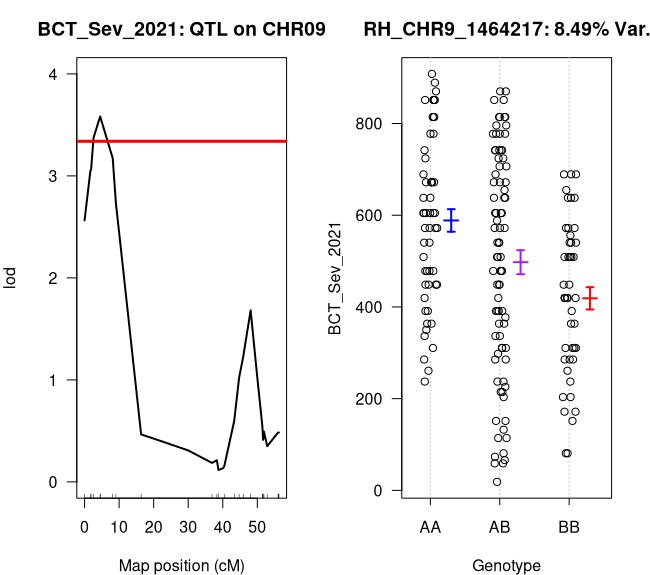
Figure 12: Incid_2019 QTL and Effect Plots

References
Bradbury, P. J., Zhang, Z., Kroon, D. E., Casstevens, T. M., Ramdoss, Y., and Buckler, E.S. 2007. TASSEL: Software for association mapping of complex traits in diverse samples. Bioinformatics 23:2633-2635. https://doi.org/10.1093/bioinformatics/btm308.
Money, D., Gardner, K., Migicovsky, Z., Schwaninger, H., Zhong, G. Y., Myles, S. 2015. LinkImpute: Fast and Accurate Genotype Imputation for Nonmodel Organisms. G3 5(11):2383-90. https://doi.org/10.1534/g3.115.021667.
Rastas, P. 2017. Lep-MAP3: robust linkage mapping even for low-coverage whole genome sequencing data. Bioinformatics 33(23):3726-3732. https://doi.org/10.1093/bioinformatics/btx494.
Zou, C., Sapkota, S., Figueroa-Balderas, R., Glaubitz, J., Cantu, D., Kingham, B. F., Sun, Q., and Cadle-Davidson, L. 2023. A multitiered haplotype strategy to enhance phased assembly and fine mapping of a disease resistance locus. Plant Physiology 193(4):2321–2336. https://doi.org/10.1093/plphys/kiad494.